20个圆满简约的网页设计展示
日期:2014-05-17 浏览次数:20791 次
?
关于网页设计,每个人都有不一样的设计观念。即使是你面对的客户也一样,甚至可能时刻都在改变他的想法,让你一遍又一遍的修改界面。这时候你得要有一定的设计心理学,首先项目开始前就制定要设计方向,之后要把自己的设计理念灌输到客户的大脑里,让TA理解你的设计观念。这说起来简单的几句话,做起来可是一点不简单的。你需要不断的项目中学会交流和设计的结合。有的客户会让你精疲力尽的(相信我:D)。下面给大家展示的是20个简约的艺术设计如何运用到网页中的案例。这些站点将简约完美的呈现,让视觉更有冲击力。
Astheria
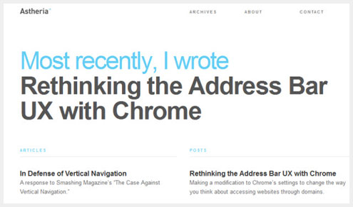
The personal website for a designer’s writing excerpts. A left hand column for articles and right hand column for posts keeps content organized and up-to-date, with the most recent selections appearing first.
Visit Astheria →
A Working Library
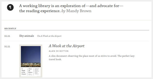
Organized like a blog and styled in a minimal book-like way. The simple lines separating items are the only real design elements within the page.
Visit A Working Library →
Because Studio
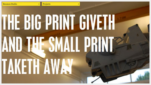
Effective example of what large typography and a splash of accent color can do.
Visit Because Studio →
Benny Roth
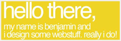
One bold web page background color is all that’s necessary to grab your attention and carefully balanced out by simple graphics and tasteful writing.
Visit Benny Roth →
Cade Martin
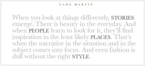
Unexpected minimalism: The photography website of Cade Martin, who forgoes images entirely and focuses only on a paragraph of light grey text, so light it almost blends into the background.
Visit Cade Martin →
Dan Joe Design
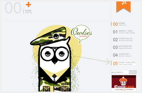
Dan Joe Designs’ signature graphic makes two simple statements: The first, and most important, emphasizes the quality of the designer’s work, and secondly it subtly directs your eye towards the navigation.
Visit Dan Joe Design →
Fat Man Collective
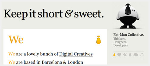
The simple list of company attributes, services and projects is sometimes all that’s
