用css3兑现漂亮便签样式
日期:2014-05-17 浏览次数:21136 次
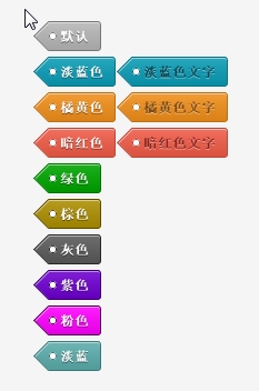
用css3实现漂亮便签样式
效果图如下:
代码如下:
<!doctype html>
<html>
<head>
	<meta charset="utf-8">
	<title>Live Preview</title>

	<style>

body {

    background: #f5f5f5;

    font-family: Arial, "Helvetica Neue", Helvetica, sans-serif;

    font-size: 12px;

    padding: 50px 0 10px 0;

}


.custom {

	width: 260px;

	margin: 0 auto;

}


.tags {

    padding: 0;

}


.tags a {

    background-image: -moz-linear-gradient(top,  rgba(255,255,255,0.12) 0%, rgba(0,0,0,0.1) 99%, rgba(0,0,0,0.1) 100%);

    background-image: -webkit-gradient(linear, left top, left bottom, color-stop(0%,rgba(255,255,255,0.12)), color-stop(99%,rgba(0,0,0,0.1)), color-stop(100%,rgba(0,0,0,0.1)));

    background-image: -webkit-linear-gradient(top,  rgba(255,255,255,0.12) 0%,rgba(0,0,0,0.1) 99%,rgba(0,0,0,0.1) 100%);

    background-image: -o-linear-gradient(top,  rgba(255,255,255,0.12) 0%,rgba(0,0,0,0.1) 99%,rgba(0,0,0,0.1) 100%);

    background-image: -ms-linear-gradient(top,  rgba(255,255,255,0.12) 0%,rgba(0,0,0,0.1) 99%,rgba(0,0,0,0.1) 100%);

    background-image: linear-gradient(top,  rgba(255,255,255,0.12) 0%,rgba(0,0,0,0.1) 99%,rgba(0,0,0,0.1) 100%);

    filter: progid:DXImageTransform.Microsoft.gradient( startColorstr='#1fffffff', endColorstr='#1a000000',GradientType=0 );

    -webkit-border-top-right-radius: 3px;

    -webkit-border-bottom-right-radius: 3px;

    -moz-border-radius-topright: 3px;

    -moz-border-radius-bottomright: 3px;

    border-top-right-radius: 3px;

    border-bottom-right-radius: 3px;

    box-shadow: 0 1px 0 rgba(255,255,255,0.5) inset;

    display: inline-block;

    font-size: 12px;

    font-weight: bold;

    line-height: 25px;

    height: 25px;

    padding: 0 10px;

    position: relative;

    text-shadow: 0 1px 0 rgba(0,0,0,0.5);

    text-decoration: none;

    margin: 0 15px 5px 0;

    border: 1px solid;

    border-left: 0;

    color: #fff;

}


.tags a:before {

    background-image: -moz-linear-gradient(-45deg,  rgba(255,255,255,0.12) 0%, rgba(0,0,0,0.1) 99%, rgba(0,0,0,0.1) 100%);

    background-image: -webkit-gradient(linear, left top, right bottom, color-stop(0%,rgba(255,255,255,0.12)), color-stop(99%,rgba(0,0,0,0.1)), color-stop(100%,rgba(0,0,0,0.1)));

    background-image: -webkit-linear-gradient(-45deg,  rgba(255,255,255,0.12) 0%,rgba(0,0,0,0.1) 99%,rgba(0,0,0,0.1) 100%);

    background-image: -o-linear-gradient(-45deg,  rgba(255,255,255,0.12) 0%,rgba(0,0,0,0.1) 99%,rgba(0,0,0,0.1) 100%);

    background-image: -ms-linear-gradient(-45deg,  rgba(255,255,255,0.12) 0%,rgba(0,0,0,0.1) 99%,rgba(0,0,0,0.1) 100%);

    background-image: linear-gradient(-45deg,  rgba(255,255,255,0.12) 0%,rgba(0,0,0,0.1) 99%,rgba(0,0,0,0.1) 100%);

    filter: progid:DXImageTransform.Microsoft.gradient( startColorstr='#1fffffff', endColorstr='#1a000000',GradientType=1 );

    -webkit-transform: rotate(45deg);

    -moz-transform: rotate(45deg);

    -ms-transform: rotate(45deg);

    -o-transform: rotate(45deg);

    transform: rotate(45deg);

    filter: progid:DXImageTransform.Microsoft.Matrix(/* IE6–IE9 */ M11=0.7071067811865476, M12=-0.7071067811865475, M21=0.7071067811865475, M22=0.7071067811865476, sizingMethod='auto expand');

    zoom: 1;

    box-shadow: 1px 0px 0 rgba(255,255,255,0.5) inset;

    content: '';

    height: 18px;

    left: -10px;

    position: absolute;

    top: 3px;

    width: 18px;

    z-index: -1;

    border: 1px solid;

    border-right: 0;

    border-top: 0;

}


.tags a:after {

    position: absolute;

    background: #fff;

    content: '';

    width: 5px;

    height: 5px;

    left: 0;

    border-radius: 5px;

    top: 9px;

    border: 1px solid #888;

}


.tags a:hover {

    background-image: -moz-linear-gradient(
免责声明: 本文仅代表作者个人观点,与爱易网无关。其原创性以及文中陈述文字和内容未经本站证实,对本文以及其中全部或者部分内容、文字的真实性、完整性、及时性本站不作任何保证或承诺,请读者仅作参考,并请自行核实相关内容。