CSS 格局总结——变宽度布局
日期:2014-05-16 浏览次数:21199 次
CSS 布局总结——变宽度布局
1-2-1 等比例变宽
1-2-1 单列变宽

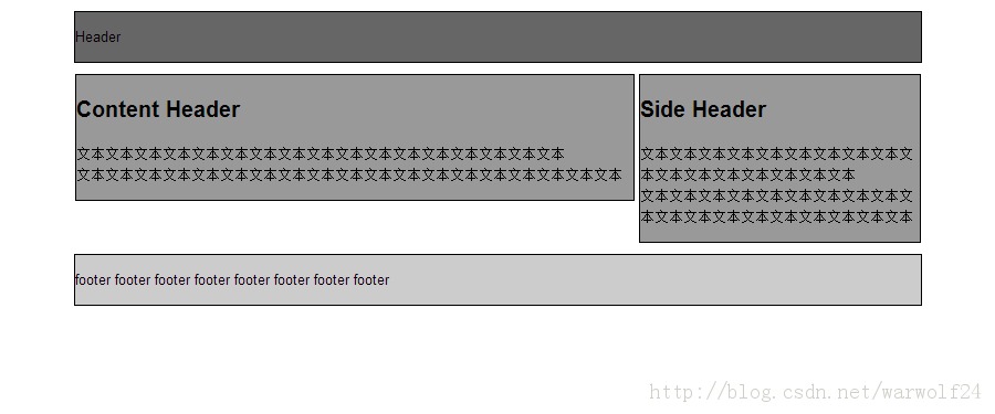
变宽度布局
1-2-1 等比例变宽
总宽度设置 width: 85%; min-width: 650px; (关于IE6的min-width支持,可用)
content 设置 width: 66%; float: left;
side 设置 width: 33%; float: right;
加入clear 空div
HTML 结构:
<!DOCTYPE HTML>
<html>
	<head>
    	<title>1-2-1 等比例变宽</title>
        <meta charset="utf-8" />
    </head>

    <body>
    	<div id="header">
            <p>Header</p>
        </div>

        <div id="container">
            <div id="content">
                <h2>Content Header</h2>
                <div class="main">
                    <p>
                        文本文本文本文本文本文本文本文本文本文本文本文本文本文本文本文本文本<br>
                        文本文本文本文本文本文本文本文本文本文本文本文本文本文本文本文本文本文本文本
                    </p>
                </div>
            </div>
            <div id="side">
                <h2>Side Header</h2>
                <div class="main">
                    <p>
                        文本文本文本文本文本文本文本文本文本文本文本文本文本文本文本文本文本<br>
                        文本文本文本文本文本文本文本文本文本文本文本文本文本文本文本文本文本文本文本
                    </p>
                </div>
            </div>
            <div id="clear"></div>
        </div>

        <div id="footer">
			<p>footer footer footer footer footer footer footer footer</p>
        </div>
    </body>
</html>
CSS: body{
font: 13px/1.5 Arial;
margin: 0;
padding: 0;
}
#header, #container, #footer{
width: 85%;
margin: 10px auto;
min-width: 650px;
}
#header{
border: 1px solid black;
background-color: #666;
}
#content{
border: 1px solid black;
background-color: #999;
width: 66%;
float: left;
}
#side{
border: 1px solid black;
background-color: #999;
width: 33%;
float: right;
}
#clear{
clear: both;
}
#footer{
border: 1px solid black;
background-color: #CCC;
}1-2-1 单列变宽
side 固定宽度,content 随窗口宽度变化
side设置 width: 200px; float: left;
在content外层加入 contentWrap,contentWrap 设置为 width: 100%; margin-right: -220px; float: right;
而content 设置为 margin-right: 220px;
这样就利用了wrap实现了content的宽度为 100%-320px
HTML 结构:
<!DOCTYPE HTML>
<html>
	<head>
    	<title>1-2-1 单列变宽</title>
        <meta charset="utf-8" />
    </head>

    <body>
    	<div id="header">
            <p>Header</p>
        </div>

        <div id="container">
            <div id="contentWrap">
                <div id="content">
                    <h2>Content Header</h2>
                    <div class="main">
                        <p>
                            文本文本文本文本文本文本文本文本文本文本文本文本文本文本文本文本文本<br>
                            文本文本文本文本文本文本文本文本文本文本文本文本文本文本文本文本文本文本文本
                        </p>
                    </div>
                </div&g
免责声明: 本文仅代表作者个人观点,与爱易网无关。其原创性以及文中陈述文字和内容未经本站证实,对本文以及其中全部或者部分内容、文字的真实性、完整性、及时性本站不作任何保证或承诺,请读者仅作参考,并请自行核实相关内容。