持续学习-CSS3页面美化之让页面动起来
日期:2014-05-17 浏览次数:21261 次
继续学习-CSS3页面美化之让页面动起来
这里还添加了hover样式,就是为了鼠标移入变换的。
然后在导航栏的a标签的hover加入这个动画
注释掉的是分开的写法。
然后给a标签添加动画效果:
ok,这里给出全部CSS代码,便于大家交流。style.css:
继昨日的美化一轮以后,页面也是蛮好看的了。但是还缺乏些动态响应。今天带来的是CSS3的动态响应。由于CSS3对于动画和变形这一部分,某些浏览器支持不好(IE),所以这里仅仅是使用Chrome来写的,使用的前缀是-webkit-,效果还是蛮赞的。
话不多说,首先我们来改造按钮,让它在鼠标移动后加入动画效果。

当鼠标移入以后,会缓慢变化:

修改后的content a的样式为:
#content a{
	font-family:Arial, Helvetica, Verdana, sans-serif;
	font-size:1.65em;
	text-transform:uppercase;
	text-decoration:none;
	background-color:#B01C20;
	border-radius:8px;
	color:white;
	padding:3.8461538%;
	float:left;
	background: -webkit-linear-gradient(90deg, #B01C20 0%, #F15C60 100%);
	margin-top:30px;
	box-shadow:5px 5px 5px hsla(0, 0%, 26.6667%, 0.8);
	text-shadow:0px 1px black;
	border:1px solid #BFBFBF;
	-webkit-transition-property: border, color, text-shadow;
	-webkit-transition-duration: 2s, 3s, 8s;
	-webkit-transition-timing-function:ease;
	-webkit-transition-delay:0s;
}
#content a:hover{
	border: 1px solid #000000;
	color:#000000;
	text-shadow: 0px 1px white;
}
这里还添加了hover样式,就是为了鼠标移入变换的。
其次,改造导航栏。让鼠标移入有更加绚烂的提示效果。

首先定义动画帧
@-webkit-keyframes warning {
	0%{
		text-shadow: 0px 0px 4px #000000;
	}
	50%{
		text-shadow: 0px 0px 20px #000000;
	}
	100%{
		text-shadow: 0px 0px 4px #000000;
	}
}
然后在导航栏的a标签的hover加入这个动画
nav ul li a:hover{
	-webkit-animation: warning 1.5s infinite ease-in;
	//-webkit-animation-name: warning;
	//-webkit-animation-duration: 1.5s;
	//-webkit-animation-timing-function: ease;
	//-webkit-animation-iteration-count: infinite;
	//-webkit-animation-play-state: running;
	//-webkit-animation-delay: 0s;
	//-webkit-animation-fill-mode: none;
	color:hsl(359, 99%, 40%);
}
注释掉的是分开的写法。
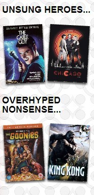
最后,我们让侧边栏的海报在网页载入完成后,抖动几下。
也是先加入关键帧:
@-webkit-keyframes swing {
	0%{
		-webkit-transform: rotate(3deg);
	}
	20%{
		-webkit-transform: rotate(7deg);
	}
	60%{
		-webkit-transform: rotate(10deg);
	}
	80%{
		-webkit-transform: rotate(7deg);
	}
	100%{
		-webkit-transform: rotate(3deg);
	}
}
然后给a标签添加动画效果:
aside section a:nth-child(odd) img{
	-webkit-transform: rotate(3deg);
	-webkit-animation: swing 0.1s 5 ease-in;
}
aside section a:nth-child(even) img{
	-webkit-transform: rotate(-3deg);
	-webkit-animation: swing 0.1s 5 0.3s ease-in;
}
ok,这里给出全部CSS代码,便于大家交流。style.css:
@font-face {
	font-family: 'BebasNeueRegular';
	src:url('../fonts/BebasNeue-webfont.eot');
	src:url('../fonts/BebasNeue-webfont.eot?#iefix') format('embedded-opentype'),
		url('../fonts/BebasNeue-webfont.woff') format('woff'),
		url('../fonts/BebasNeue-webfont.ttf') format('truetype'),
		url('../fonts/BebasNeue-webfont.svg#BebasNeueRegular') format('svg');
	font-weight:400;
}
@-webkit-keyframes warning {
	0%{
		text-shadow: 0px 0px 4px #000000;
	}
	50%{
		text-shadow: 0px 0px 20px #000000;
	}
	100%{
		text-shadow: 0px 0px 4px #000000;
	}
}

@-webkit-keyframes swing {
	0%{
		-webkit-transform: rotate(3deg);
	}
	20%{
		-webkit-transform: rotate(7deg);
	}
	60%{
		-webkit-transform: rotate(10deg);
	}
	80%{
		-webkit-transform: rotate(7deg);
	}
	100%{
		-webkit-transform: rotate(3deg);
	}
}

body{
	//background-image:url(image/bg4.png);
	//background-repeat:repeat;
	background-image:
		-webkit-radial-gradient(hsla(0, 0%, 87%, 0.37) 9px, transparent 10px),
		-webkit-repeating-radial-gradient(hsla(0, 0%, 87%, 0.31) 0,
								hsla(0, 0%, 87%, 0.31) 4px, transparent 5px,
								transparent 20px, hsla(0, 0%, 87%, 0.31) 21px,
								hsla(0, 0%, 87%, 0.31) 25px,transparent 26px,
								transparent 50px);
	background-size: 30px 30px, 90px
免责声明: 本文仅代表作者个人观点,与爱易网无关。其原创性以及文中陈述文字和内容未经本站证实,对本文以及其中全部或者部分内容、文字的真实性、完整性、及时性本站不作任何保证或承诺,请读者仅作参考,并请自行核实相关内容。